3. Tutorials
For these tutorials you will need to download the IRIS data, and make sure that you are in the same directory as the files to be able to run this code. We start by importing the relevant packages and setting out some plotting options:
[1]:
%matplotlib inline
import numpy as np
import astropy.io.fits as fits
import matplotlib.pyplot as plt
from astropy.wcs import WCS
# Set up some default matplotlib options
plt.rcParams['figure.figsize'] = [10, 6]
plt.rcParams['xtick.direction'] = 'out'
plt.rcParams['image.origin'] = 'lower'
plt.rcParams['image.cmap'] = 'viridis'
3.1. Mg II Dopplergrams
In this tutorial we are going to produce a Dopplergram for the Mg II k line from an IRIS 400-step raster. The Dopplergram is obtained by subtracting the intensities at symmetrical velocity shifts from the line core (e.g. ±50 km/s). For this kind of analysis we need a consistent wavelength calibration for each step of the raster.
This very large dense raster took more than three hours to complete the 400 scans (30 s exposures), which means that the spacecraft’s orbital velocity changes during the observations. This means that any precise wavelength calibration will need to correct for those shifts.
Start by downloading an IRIS dataset from 2014 July 8: follow this link and download the raster file (726 Mb). Download it to a directory of your choice. Untar it, e.g. on a UNIX system:
$ tar zxvf iris_l2_20140708_114109_3824262996_raster.tar.gz
Let’s open the file:
[2]:
iris_file = fits.open("iris_l2_20140708_114109_3824262996_raster_t000_r00000.fits",
                 memmap=True, do_not_scale_image_data=True)
Here we use memmap to save memory.
We can now print out the spectral windows in the file:
[3]:
hd = iris_file[0].header
print('Window. Name      : wave start - wave end\n')
for i in range(hd['NWIN']):
    win = str(i + 1)
    print('{0}. {1:15}: {2:.2f} - {3:.2f} Å'
          ''.format(win, hd['TDESC' + win], hd['TWMIN' + win], hd['TWMAX' + win]))
Window. Name      : wave start - wave end

1. C II 1336      : 1332.70 - 1337.58 Å
2. Fe XII 1349    : 1347.68 - 1350.90 Å
3. O I 1356       : 1352.25 - 1356.69 Å
4. Si IV 1394     : 1390.90 - 1396.19 Å
5. Si IV 1403     : 1398.63 - 1406.34 Å
6. 2832           : 2831.23 - 2834.26 Å
7. 2814           : 2812.54 - 2816.41 Å
8. Mg II k 2796   : 2792.98 - 2806.63 Å
We see that Mg II is in window 8, so let’s load those data and get the WCS information to construct the wavelength arrays and get coordinates:
[4]:
data = iris_file[8].data
wcs = WCS(iris_file[8].header)
And let’s calculate the wavelength array:
[5]:
m_to_nm = 1e9  # convert wavelength to nm
wave = wcs.all_pix2world(np.arange(wcs._naxis[0]), [0.], [0.], 1)[0] * m_to_nm
We can see how the the spatially averaged spectrum looks like:
[6]:
plt.plot(wave, data.mean((0, 1)))
[6]:
[<matplotlib.lines.Line2D at 0xa80fe2128>]
Because we used memmap, the intensity values are unscaled and do not represent the IRIS data number (DN). For the purposes of this tutorial this is not a problem.
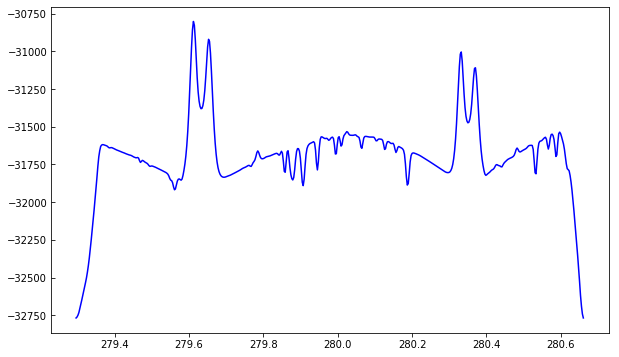
To better understand the orbital velocity problem let us look at how the line intensity varies for a strong Mn I line at around 280.2 nm, in between the Mg II k and h lines. For this dataset, the line core of this line falls around index 350. To plot a spectroheliogram in the correct orientation we will transpose the data:
[7]:
fig = plt.figure(figsize=(6, 10))
plt.imshow(data[..., 350].T, vmin=-32000, vmax=-31600, aspect=0.5)
[7]:
<matplotlib.image.AxesImage at 0xa8114ffd0>
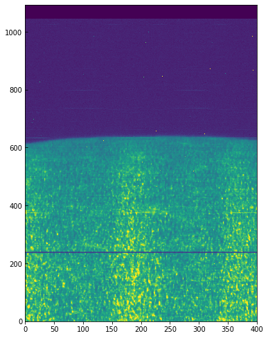
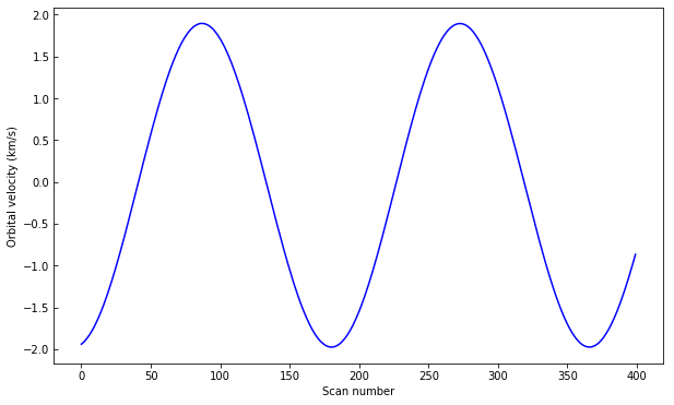
You can see a regular bright-dark pattern along the x axis, an indication that its intensities are not taken at the same position in the line because of wavelength shifts. The shifts are caused by the orbital velocity changes, and we can find these in the auxiliary metadata:
[8]:
aux = iris_file[-2]
v_obs = aux.data[:, aux.header['OBS_VRIX']]
v_obs /= 1000.  # convert to km/s
plt.plot(v_obs)
plt.ylabel("Orbital velocity (km/s)")
plt.xlabel("Scan number")
[8]:
Text(0.5,0,'Scan number')
To look at intensities at any given scan we only need to subtract this velocity shift from the wavelength scale, but to look at the whole image at a given wavelength we must interpolate the original data to take this shift into account. Here is a way to do it (note that array dimensions apply to this specific set only!):
[9]:
from scipy.constants import c
from scipy.interpolate import interp1d
c_kms = c / 1000.
wave_shift = - v_obs * wave[350] / (c_kms)
# linear interpolation in wavelength, for each scan
for i in range(iris_file[0].header['NRASTERP']):
    tmp = interp1d(wave - wave_shift[i], data[i], bounds_error=False)
    data[i] = tmp(wave)
And now we can plot the shifted data to see that the large scale shifts have disappeared:
[10]:
fig = plt.figure(figsize=(6, 10))
plt.imshow(data[..., 350].T, vmin=-32000, vmax=-31600, aspect=0.5)
[10]:
<matplotlib.image.AxesImage at 0xa82540278>
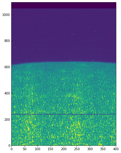
Some residual shift remains, but we will not correct for it here. A more elaborate correction can be obtained by the IDL routine iris_prep_wavecorr_l2, but this has not yet been ported to Python see the IDL version of this tutorial for more details.
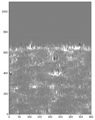
We can use the calibrated data for example to calculate Dopplergrams. A Dopplergram is here defined as the difference between the intensities at two wavelength positions at the same (and opposite) distance from the line core. For example, at +/- 50 km/s from the Mg II k3 core. To do this, let us first calculate a velocity scale for the k line and find the indices of the -50 and +50 km/s velocity positions (here using the convention of negative velocities for up flows):
[11]:
mg_k_centre = 279.6351  # in nm
pos = 50  # in km/s around line centre
velocity =  (wave - mg_k_centre) * c_kms / mg_k_centre
index_p = np.argmin(np.abs(velocity - pos))
index_m = np.argmin(np.abs(velocity + pos))
doppl = data[..., index_m] - data[..., index_p]
And now we can plot this as before (intensity units are again arbitrary because of the unscaled DNs):
[12]:
fig = plt.figure(figsize=(6, 10))
plt.imshow(doppl.T, cmap='gist_gray', aspect=0.5,
           vmin=-700, vmax=700,)
[12]:
<matplotlib.image.AxesImage at 0xa82bf4908>
3.2. Time series analysis
In this tutorial we are going to work with spectra and slit-jaw images to study dynamical phenomena. The subject of this example is umbral flashes.
Start by downloading this IRIS dataset from 2013 September 2. Download the 1400 slit-jaw file and the raster file (about 900 Mb in total) to a directory of your choice. Unzip all the files, e.g. on a UNIX system:
$ gunzip *fits.gz
$ tar zxvf *.tar.gz
Now we load the spectrograph FITS file and get the header:
[13]:
sp = fits.open("iris_l2_20130902_163935_4000255147_raster_t000_r00000.fits")
sp_hd = sp[0].header
Using the header information, we print out the different spectral windows:
[14]:
for i in range(sp_hd['NWIN']):
    print('%i %15s' % (i + 1, sp_hd['TDESC' + str(i + 1)]))
1       C II 1336
2     Fe XII 1349
3       Cl I 1352
4        O I 1356
5      Si IV 1394
6      Si IV 1403
7            2786
8    Mg II k 2796
9            2830
We can now get the data and wavelength for the Mg II and C II windows, and the array of times (since the start of the observations):
[15]:
data_c = sp[1].data
data_mg = sp[8].data

from astropy.wcs import WCS
m_to_nm = 1e9

sp[1].header['CDELT3'] = 1.e-9  # Fix WCS for sit-and-stare
wcs_c = WCS(sp[1].header)
wave_c = wcs_c.all_pix2world(np.arange(data_c.shape[-1]),
                             [0.], [0.], 0)[0] * m_to_nm
sp[8].header['CDELT3'] = 1.e-9  # Fix WCS for sit-and-stare
wcs_mg = WCS(sp[8].header)
wave_mg = wcs_mg.all_pix2world(np.arange(data_mg.shape[-1]),
                              [0.], [0.], 0)[0] * m_to_nm

time_diff = sp[-2].data[:, sp[-2].header['TIME']]
times = np.datetime64(sp_hd['DATE_OBS']) + time_diff * np.timedelta64(1, 's')
For this dataset the spectral cadence is about 3 seconds. The Mg II k3 core is located around wavelength pixel 103. We can use this information to make a space-time image of the Mg II k3 wavelength:
[16]:
plt.imshow(data_mg[..., 103].T, vmin=0, vmax=200, aspect='auto')
[16]:
<matplotlib.image.AxesImage at 0xa82a25198>
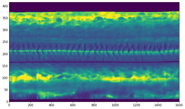
In the above, the axis correspond to pixel numbers. It is also possible to plot with the time and coordinate axis:
[17]:
# y scale, convert from degrees to arcsec
y_arcsec = wcs_mg.all_pix2world([0.], np.arange(data_mg.shape[1]), [0.], 0)[1] * 3600.

import matplotlib.dates as dates
from datetime import datetime
times_num = dates.date2num(times.astype(datetime))

fig, ax = plt.subplots()
ax.imshow(data_mg[..., 103].T, vmin=0, vmax=200, aspect='auto',
          extent=[times_num[0], times_num[-1], y_arcsec[0], y_arcsec[-1]])
ax.xaxis_date()
date_format = dates.DateFormatter('%H:%M')
ax.xaxis.set_major_formatter(date_format)
ax.set_xlabel("Time")
ax.set_ylabel("Slit position, solar Y (arcsec)")
[17]:
Text(0,0.5,'Slit position, solar Y (arcsec)')
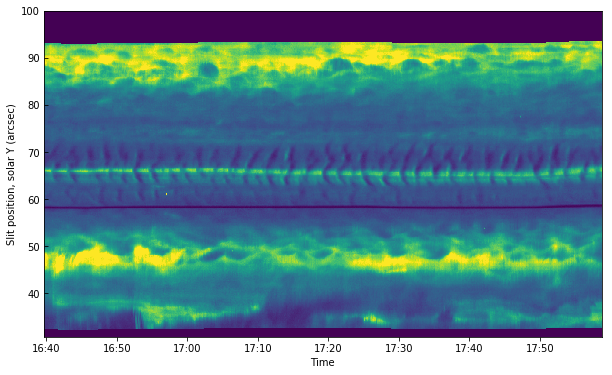
The middle section between 60”-75” is on the umbra of a sunspot, even though it is not obvious from this image. One can see very clearly the umbral oscillations, with a clear regular pattern of dark/bright streaks. Let us now load the 1400 slit-jaw and plot it for context:
[18]:
sji = fits.open("iris_l2_20130902_163935_4000255147_SJI_1400_t000.fits")
wcs = WCS(sji[0].header)
ax = plt.subplot(projection=wcs.dropaxis(-1))
ax.imshow(sji[0].data[0], vmin=0, vmax=200)
ax.coords[0].set_major_formatter('s.s')
ax.coords[1].set_major_formatter('s.s')
WARNING: FITSFixedWarning: 'unitfix' made the change 'Changed units: 'seconds' -> 's''. [astropy.wcs.wcs]
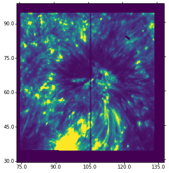
The slit pixel 220 is a location on the sunspot’s umbra. We will use it to get some plots. For example, let’s plot the k3 intensity (spectral pixel 103 of data_mg) and the core of the brightest C II line (spectral pixel 90 of data_c) vs. time in minutes (showing first ~10 minutes only):
[19]:
plt.plot(times[:200], data_mg[:200, 220, 103])
plt.plot(times[:200], data_c[:200, 220, 90] * 2)
plt.ylim(0, 85)
axis_lim = plt.axis()
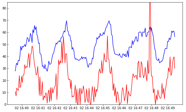
In the above we are multiplying the C II data by two to get the two lines closer. Image now you wanted to compare these oscillations with the intensity on the slit-jaw. How to do it? The slit-jaws are tipically taken at a different cadence, so you will need to load the corresponding time array for the 1400 slit-jaw:
[20]:
time_diff = sji[1].data[:, sji[1].header['TIME']]
times_sji = np.datetime64(sji[0].header['DATE_OBS']) + time_diff * np.timedelta64(1, 's')
And now we can plot both spectral lines and slit-jaw for a pixel close to the slit at the same y position (index 220):
[21]:
plt.plot(times[:200], data_mg[:200, 220, 103])
plt.plot(times[:200], data_c[:200, 220, 90] * 2)
plt.plot(times_sji, sji[0].data[:, 190, 220], 'y-')
plt.axis(axis_lim)
[21]:
(735113.693821412, 735113.7013329861, 0.0, 85.0)
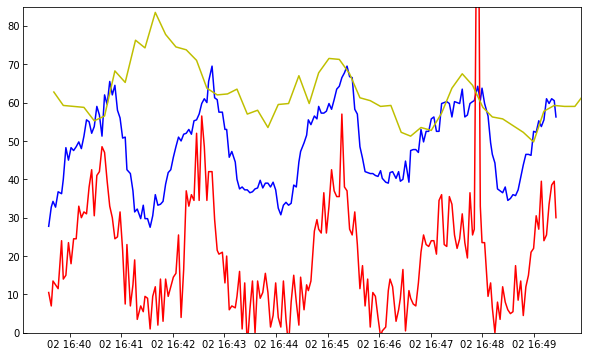
You are now ready to explore all the correlations, anti-correlations, and phase differences.